A man enters a room. Before anyone processes what label he is wearing — before a single monogram is consciously noted — the brain has already read his silhouette through the fabric that carries it. This judgment is ancient, prerational, and entirely unforgiving. The surface of his jacket, the weight of his trouser drape, the way light falls and recovers across his shoulders all transmit a message more primal than any logo could override.
Most men spend their attention on brand names. This is a mistake. A name is a secondary signal, processed only after the eye has already absorbed the tactile truth of a garment. If the fabric is poor, the brand becomes an alibi for something that should have spoken for itself. If the fabric is exceptional, the brand becomes irrelevant.

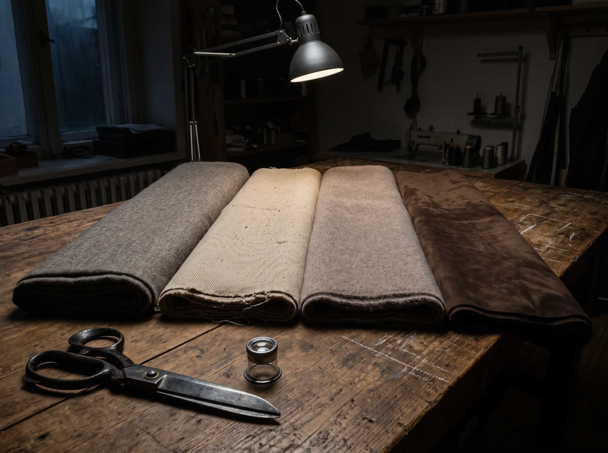
The Language of Surface Light
Fabric communicates through light. This is the first rule every buyer learns on the floor, and the first rule most consumers never hear. The way a textile absorbs, reflects, or diffuses light determines whether it reads as substantial or superficial long before any detail is visible.
Matte wool flannel, for example, absorbs light softly. It creates a visual depth that signals warmth and composure. A shiny synthetic blend, by contrast, throws light back in hard, flat planes. It reads as thin, regardless of how much was paid. The human eye has been trained by millennia of evolution to read surface quality as a proxy for health, capability, and status. A dull, chalky finish on good wool registers as confident. A glossy, reflective sheen on a cheaply blended suit registers as trying too hard.
Grain leather behaves the same way. Full-grain calfskin holds a fine, natural texture that scatters light into a soft glow. Corrected-grain leather, buffed to an artificial smoothness, reflects light with a plastic uniformity. The difference is visible from across a room, and it is felt before it is understood.
Question: How do different high-quality fabrics behave under light, and what does each communicate?
Fabric | Light Behaviour | What It Signals |
|---|---|---|
Matte wool flannel | Absorbs light softly, deep and dry | Composure, warmth, seriousness |
Fine worsted wool | Subtle natural lustre, not shine | Precision, discipline, professional authority |
Brushed cashmere | Diffuse, almost powdery glow | Understated luxury, soft strength |
Raw cotton twill | Flat, structural, minimal reflection | Utilitarian confidence, no pretense |
Reverse suede | Light-trapping nap, zero shine | Textural intelligence, quiet individuality |
Full-grain calfskin | Low, organic lustre with visible grain | Endurance, maturity, self-respect |
Density, Drape, and the Gravity of Good Cloth
Brand names are weightless. Fabric has weight, and that weight determines how a garment moves. A jacket cut from dense, high-twist wool will hold its shape and travel with the body. A jacket cut from a loosely woven blend will collapse, wrinkle, and drift. The difference is drape. Drape is the silent proof of quality, and it cannot be faked with a label.
Wool with sufficient density hangs from the shoulder and follows the torso without gripping. It moves with the wearer, absorbing motion rather than fighting it. Cheap cloth does the opposite. It buckles at the elbow, bags at the knee, and never stops reminding the room that it is failing. This is why a man in a well-made wool overcoat can stand still and look formidable, while a man in a poorly structured coat looks like he is wearing a costume.
Cotton offers a different test. A fine, long-staple cotton shirt feels substantial without stiffness. It holds a crease when pressed and softens with age rather than degrading. A short-staple cotton shirt, by contrast, feels thin from the first wear. It wrinkles aggressively and loses its collar shape after a few washes. Both shirts may be white, both may carry a known label. Only one will read as refined.
The Suede Lesson
Suede is the material that separates men who understand texture from men who simply buy categories. Cheap suede is thin, uniform, and prone to staining in ways that announce its weakness. Good suede is thick, with a nap that moves when touched and returns when released. It absorbs light into a deep, dusty finish that signals considered taste. It is impractical in all the right ways — a man who wears quality suede is a man who values texture over convenience. That preference communicates something important.
I once watched a client deliberate between two pairs of chukka boots. One carried a more recognized name. The other had a superior suede with a denser nap and a cleaner last. He chose the name. Six months later, the suede on the branded pair had flattened into a tired smoothness. The lesson was inexpensive, but it stuck. Buy the material, not the marketing.

Training the Eye
Recognizing good fabric is not a matter of expertise. It is a matter of attention. Run your thumb across the surface. Does it recover? Hold it up to the light. Does it shift depth or just shine? Drape it over your arm. Does it hang or collapse? These questions answer themselves in seconds and tell you more than a label ever could.
The men I trained on the buying floor learned to assess fabric with their eyes closed. The hand-feel of a good wool, the slight coolness of quality cotton, the dry warmth of cashmere — these sensations imprint themselves quickly. Once you know what substance feels like, you cannot unknow it. And from that point forward, every brand name becomes secondary.
A Final Word on Materials
A garment that looks expensive is rarely the one with the highest price. It is the one with the most honest fabric. Honest fabric behaves predictably. It drapes well, ages gracefully, and never relies on a printed logo to explain its value. When a man wears garments built from such materials, he looks substantial. He looks like he knows what he is doing. The brand, if anyone ever notices it, is merely a footnote.
Luxury is not the label. It is the discipline. And discipline, in the world of cloth, begins with what you allow against your skin.